How To Be Creative: A Designer’s Guide

Local Pages` creative designer explores the issue

Are we born with a creative mind, as opposed to a mathematical mind? Some say we are, and that we can’t be both. We are either governed by the right side (the creative side), or left side (the logical side). This is only a theory – that our characteristics come through according to which side is more dominant. But new research says otherwise.

Creativity can be nurtured in someone who perhaps thinks they are not creative. We all have to be creative to solve problems in life in one way or another. Obviously creativity is very subjective. If you asked 10 different people for feedback on your creative ideas, you’d get 10 different answers! Do not let criticism strangle your creative process. It’s good to listen to others and their constructive criticism, and by taking the positive out of this, you can use some of what they say to play around with other ideas.

Nothing is perfect, so don’t feel you have to come up with the perfect solution. Don’t rule out working on ideas that perhaps you are not so keen on because following these paths may make you come up with another solution that fits. Of course someone who is trained in creativeness will be able to initiate ideas quicker than someone with no experience.

Some creative designers prefer to work on their own but for ideas to flow, it’s always good to share. This is called “brainstorming”, where a few creative minds get together and thrash out an idea or concept by drawing on bits of paper with doodles or writing them down or sharing them verbally. People can bounce ideas off of each other then and perhaps take their ideas one step further in a way they hadn’t thought of. The initial brief needs to be clear and concise though. You cannot say everything in one design, so good communication is the key.

Inspiration is always a good starting point. Collect pictures, patterns or colours that you like in the form of magazine articles, photos or illustrations and make a book of them. Anything that catches your eye. Some small thing, like a colour, may spark off a flurry of creativeness and lead you in all sorts of directions. The internet is obviously a good place to explore for ideas too. Save the pages and images you like into a file on your Mac or PC and use them to get the creative juices flowing.

Think of children and how unselfconcious they generally are. Try and think like a child and your imagination may take you on a very creative journey. Try not to be too analytical. Perhaps use  a list of single words to describe the possible answers to your brief. Each word may spark an idea which may encapsulate the personality or essence of the message you want to put across. Look up key words in a thesaurus or dictionary, which in turn may spark a visual metaphor.

Let’s make up an example: Let’s say we need to design a poster for a dog’s home – they want something positive to advertise what they do. Write down key words when you think of dogs or animal sanctuaries. My thoughts are: unconditional / beautiful / refuge / safety / cuddles / fur  – the list could go on and on. Look up some of these words in a dictionary or thesaurus. I looked up “refuge”. The dictionary says “a place or situation providing safety or shelter”. Or “safety” – “the condition of being protected from or unlikely to cause danger, risk, or injury”.

Working on the word “safety”, I came up with an idea. “Safety” sparked a visual of cotton wool – you probably know the phrase – “wrap someone up in cotton wool” which suggests keeping that person safe from harm as cotton wool is so soft and inviting. This was my very first thought (write down all thoughts) and it came to me in a matter of seconds: So how about a picture of a dog surrounded by cotton wool or bouncing around a field of cotton wool?! So in a few minutes I already have one positive idea. I have roughly illustrated my idea it below.


Creative

So, now you have seen a brief outline of the creative process, go and play away! Do you have any tips of how to be creative? We’d love it if you share your own creative process below.

Share Button
Leave a comment on How To Be Creative: A Designer’s GuideCategories Blog, Branding, Design, PrintTags , , ,

How To Make Your Business Cards Stand Out

A Guide From Graphic Designer Tania Taber

Business cards are a great marketing opportunity. If you haven’t got one to give out to prospective clients, you will be missing out on potential business.

To save money, a lot of companies go to one of those online print companies and get a card churned out – you know the sort of thing – perhaps a bit of that infamous typeface “comic sans” and a cheeky cartoon or a bland clip art image – these are usually a disappointment in terms of the look and feel of the card and the general design, creating a not-so-professional image. And of course, others may use the same image as is on your card so it’s not unique to you. There are several business cards I have come across supplied by an online printers using the very same stylised illustration of animals for their business – one was for an animal acupuncturist and the other for a dog walking business. This is very confusing!

So, it’s important to get it right. It needs to stand out against the many competitors in your marketplace. You will be handing these cards out to people you meet and they will take a very quick look and then put it in their purse or wallet. So you have to grab their attention in a few seconds and this will ensure they remember you and your business.

The first thing worth mentioning is to make sure everything is spelt correctly and the information is spot-on. It may seem silly to mention this, but you’d be surprised what gets through. If there are any spelling errors, it will give the impression that your business is unprofessional and not up to the job.

You need to make sure that nothing wanders off the edge of the card so make sure you keep all written information 5mm from the edge. Any images used need to be of high quality – the higher the resolution, the better. Typography also needs to be legible – 7.5pt is the minimum size – but not too big though, as there is limited space on the card.

Be careful not to overcrowd it with information too. A typical business card size is: 85mm x 55mm. Even though the space is limited, you can still get creative! The only things that need to be on the card are: Name, job title, address, telephone numbers, email address and website, and of course THE LOGO! There is no need for company registration numbers. There might be some room for a strap line though (think “Every Little Helps” by Tesco or “I’m lovin’ it” by McDonald’s). A strap line should be as succinct as possible, five words or less if possible, and should convey the essence of your brand.


business cards


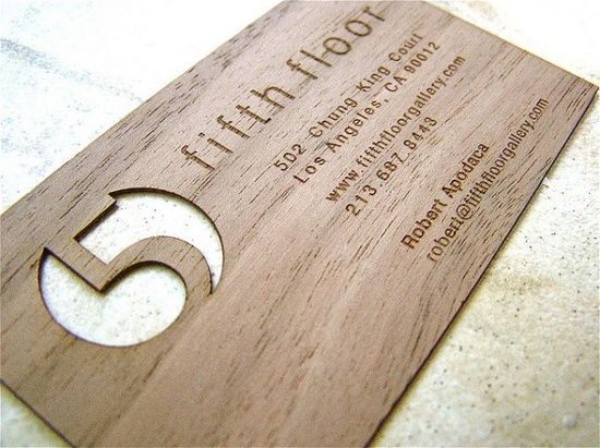
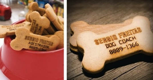
To really make the business cards stand out you can use special finishes on it to make it more tactile and memorable. Things like a spot UV (a shiny bit!) or a metallic ink or perhaps a die-cut (a funny shape cut out of the card). Of course, this makes the printing more expensive but can more than make up for that by reaping the rewards in terms of new business afterwards. Or sometimes companies go one step further and have their cards made out of materials other than card. Be as creative as your imagination or your designer’s flair allows!


business cards


Choose fonts to match your logo – either a sans serif (like Helvetica) or a serif face (like Times Roman which have flourishes at the end of the strokes). Colours must also reflect your logo with black as a good colour choice for the type information so it’s as readable as possible.


business cards


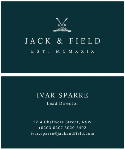
So in summary, the business cards must reflect your business and what you are trying to convey – perhaps your business was established by a family member in centuries past – you may wish to convey this with a classic design indicating a company that can be relied on, that’s classic, that is traditional, that has stood the test of time, or a new company wanting to convey structure, modernity, simplicity or freshness. Let your imagination take you to the recesses of your mind and go create!

Share Button
Leave a comment on How To Make Your Business Cards Stand OutCategories Branding, Business Tips, Design, Print, Small businessesTags , , , ,

What to consider when creating your company logo

The easiest way to recognise a company and distinguish it from others is by its logo. It’s the first impression many people form of the business, so it’s very important to get it right. If your logo looks amateurish, then that’s the impression it will create with potential clients. It may seem silly to mention, but spelling also needs to be spot-on. Any errors can create the impression of a company that doesn’t care.

A logo (whether refreshing an existing one or creating a new one) is probably one of the MOST important considerations when starting your business. Getting it designed by a professional graphic designer is the preferable route to choose. It may cost a little more than getting it done by a well-meaning friend with a PC but ultimately, it may work out to be the cheaper option. A well-designed logo should also be timeless, so it’s better to avoid the latest trends however wonderful they may seem.

Simplicity is usually the best way to go when creating a company logo. You want something that can convey what your company does in a simple and easy-to-understand graphic. You cannot depict everything that your business does in one picture but you can certainly encompass a few points. You also have to remember that your logo may have to be reproduced at a very small size (for instance on pens), so this is where simplicity comes into its own. Some companies whose names are widely known can simply use their graphic element without the name of the company (think Nike or Apple).

Talking of famous brands, let’s examine some in more detail:

Apple logo


APPLE: Simple. Effective. Classy. Easily recognised (even without the name). It can be black and white, chrome or full colour. It’s interchangeable without compromising its shape. The story behind using the apple icon is full of myth and legend. It was said to be in tribute to the World War 2 Bletchley Park code-breaker, Alan Turing, who laid the foundations for the modern-day computer (an interesting, clever and thought-provoking idea). But the truth is much simpler. Steve Jobs used to work in apple orchards and named the company and product after his favourite variety – McIntosh Apples.


Chanel logo


CHANEL, the fashion house, is another simple but very elegant logo. Ms Chanel used the two C’s of her name (Coco Chanel) and interlocked them. She used a typeface that is classic (very much like Gill Sans which is a famous font from the late 1920s). It’s classy, and has stood the test of time, and conveys the message of their brand effectively – class, wealth, elegance.


logo


THE WORLD WIDE FUND FOR NATURE has a simple panda graphic representing conservation work as its logo. Pandas are probably one of the most endangered species on the planet so it’s a fantastic image to use to convey their message. It is produced in in mono as a very simple drawing, so you recognise it without its charity name.

In summary, you want an eye-catching logo, something that people will instantly associate with your company and something they will remember and instantly recognise. It will be the ambassador for your business in graphic format, appearing on everything geared towards your business. It will say, in shorthand, what you do, how you conduct yourself and your professionalism.

Share Button
Leave a comment on What to consider when creating your company logoCategories Business Tips, DesignTags , , ,