Our Dream Office

Open Plan Office Ideas

For over 30 years we have lovingly called our converted Victorian house in Southville (Bristol) home to Local Pages. As a building it’s great, but lately our eyes have been wandering and we’ve been thinking about our dream office.

As you can imagine with a converted house, especially one of this era, the rooms are relatively small and we’re all located across two floors (and a rear extension!). We’re craving some open plan space where we can get creative, and gain some extra efficiency. We’re not talking about moving to our dream office tomorrow, but it’s OK to dream right? We thought it might be fun to share out Open Plan Office Lust List (trying saying that quickly!).

Industrial Vibes
Just look at all that SPACE! Brushed concrete floors, white walls, big windows = plenty of light, and big desks. Yes, please.


dream office


Green/Eco
We would like to be able to bring the outside in. A living wall would also help keep our air clean, naturally. We’re also loving those lighting pendants above the hot desk space.

dream office

A Pop of Colour
We would also want to introduce colour into our work space. Although ours would likely be Local Pages blue!
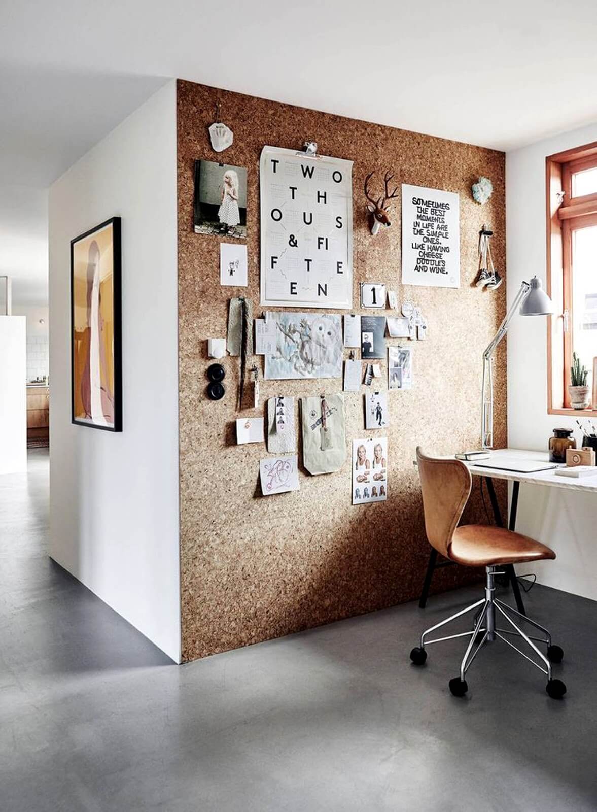
dream office


Texture
Too many white walls and industrial windows might be quite cold so we would also include lots of texture – we’re thinking cork boards and wood.

dream office


dream office


What does your dream office space look like? Have you already created it? Comment below – we’d love to hear from you.
Team LP


Share Button
Leave a comment on Our Dream OfficeCategories Blog, Office Designs, Small businessesTags , , , , ,

What to consider when creating your company logo

The easiest way to recognise a company and distinguish it from others is by its logo. It’s the first impression many people form of the business, so it’s very important to get it right. If your logo looks amateurish, then that’s the impression it will create with potential clients. It may seem silly to mention, but spelling also needs to be spot-on. Any errors can create the impression of a company that doesn’t care.

A logo (whether refreshing an existing one or creating a new one) is probably one of the MOST important considerations when starting your business. Getting it designed by a professional graphic designer is the preferable route to choose. It may cost a little more than getting it done by a well-meaning friend with a PC but ultimately, it may work out to be the cheaper option. A well-designed logo should also be timeless, so it’s better to avoid the latest trends however wonderful they may seem.

Simplicity is usually the best way to go when creating a company logo. You want something that can convey what your company does in a simple and easy-to-understand graphic. You cannot depict everything that your business does in one picture but you can certainly encompass a few points. You also have to remember that your logo may have to be reproduced at a very small size (for instance on pens), so this is where simplicity comes into its own. Some companies whose names are widely known can simply use their graphic element without the name of the company (think Nike or Apple).

Talking of famous brands, let’s examine some in more detail:

Apple logo


APPLE: Simple. Effective. Classy. Easily recognised (even without the name). It can be black and white, chrome or full colour. It’s interchangeable without compromising its shape. The story behind using the apple icon is full of myth and legend. It was said to be in tribute to the World War 2 Bletchley Park code-breaker, Alan Turing, who laid the foundations for the modern-day computer (an interesting, clever and thought-provoking idea). But the truth is much simpler. Steve Jobs used to work in apple orchards and named the company and product after his favourite variety – McIntosh Apples.


Chanel logo


CHANEL, the fashion house, is another simple but very elegant logo. Ms Chanel used the two C’s of her name (Coco Chanel) and interlocked them. She used a typeface that is classic (very much like Gill Sans which is a famous font from the late 1920s). It’s classy, and has stood the test of time, and conveys the message of their brand effectively – class, wealth, elegance.


logo


THE WORLD WIDE FUND FOR NATURE has a simple panda graphic representing conservation work as its logo. Pandas are probably one of the most endangered species on the planet so it’s a fantastic image to use to convey their message. It is produced in in mono as a very simple drawing, so you recognise it without its charity name.

In summary, you want an eye-catching logo, something that people will instantly associate with your company and something they will remember and instantly recognise. It will be the ambassador for your business in graphic format, appearing on everything geared towards your business. It will say, in shorthand, what you do, how you conduct yourself and your professionalism.

Share Button
Leave a comment on What to consider when creating your company logoCategories Business Tips, DesignTags , , ,

How to Conduct a Job Interview

The Interview Checklist

The key to a well prepared and well structured job interview is to have a clear view of the skills, knowledge and ability demanded by the job. You then need to use the interview to gather evidence to demonstrate whether the candidates meet these requirements. Please prepare well for the job interview, using this small business checklist as a prompt.


  • Re-read the advert, job and person specification.
  • If you are not seeing all the candidates, ensure that your short listing decisions are based only on the requirement of the job.
  • If you are not seeing all the candidates, sift according to criteria that is tangible from a CV i.e. headcount managed previously; operational background; achievements etc. Don’t second guess what a candidate may or may not be like or may or not have done just because it’s not on their CV. 67% of candidates omit crucial.
  • Ensure that you have prepared some standard questions. If you wish to ask additional questions, ensure that they are based on the person specification requirements for the job. These questions should be asked of all candidates to enable you to determine the best match against the job requirement.
  • Re-read all the application forms, and highlight any points which you want individual candidates to clarify (e.g. further information on qualifications or experience).
  • Arrange a suitable job interview room and make sure that you have diverted any calls and interruptions.
  • Remember that the application forms are confidential documents and should only be circulated to those people involved in the recruitment process.
  • Once you have conducted the job interview, mark your decision on whether to employ. Ensure that this is based on factual information and not gut feeling.  If you have decided to reject the candidate mark your reason where indicated on the back of the form.


Welcome 
The Job Interview Plan

  • Introduce yourself and any other interviewers
  • Put the candidate at ease
  • Explain the purpose of the interview
  • Outline the way the interview will be structured
  • Explain you will be taking notes

Ask

  • Information about the candidate that is related to the job
  • Use the criteria on the person specification
  • Identify points from the application form that need querying
  • Prepare questions in advance
  • Use open questions – move from easy to more searching ones
  • Listen and probe
  • Find out what the candidate expects from the job
  • Explore the candidate’s motivations. Are these more to do with rewards (such as money or status) or with job satisfaction?


Supply

  • Information related to the job. Summarise the main points of the job, department and company.
  • Remember the interviewer should only do 20-30% of the talking


Notes

  • Note down key points and remember that candidates are able to ask for copies of all interview notes


Wrapping up

  • Ensure there is enough time for the candidate’s questions and respond fully and positively
  • Inform candidates when they can expect to hear from you


And finally, restrict your role to

  • Asking questions
  • Clarifying queries
  • Keeping the conversation flowing
  • Providing information
  • Reassuring the candidates


After the job interview

  • Assess the candidates by using interview notes, personal specification, test results and candidate comparison forms
  • Inform all candidates of the outcome of their interview.
Share Button
Leave a comment on How to Conduct a Job InterviewCategories Business Tips, Small businessesTags , , , ,

10 Tips For A Better Website

As a Front-end Web Developer at Walpole Digital Media, I am involved with a variety of aspects of projects, from the initial client meet and requirements gathering, producing designs, bringing them to life and turning them into a website.


Although each project is different, I’ve learned that there are several universal tips that can be applied whatever the challenge. Below I share my top 10.


  1. Avoid carousel image sliders

They may look like a showcase piece, but there aren’t any studies that suggest that sliders are a good idea. When designing a website, I always insist that we avoid using a slider and point people to http://shouldiuseacarousel.com/ when wanting to explain why we should not use a slider.


And here’s why:


  1. Use images

So what should you fill the carousel-void white space with? A relevant and professional image that fits the style and theme of your website will be much more effective. This gives your user a single focal point. It doesn’t need to be boring either; a good web developer will know great ways to display imagery, just have a look at enrola. There’s a lot of focus on images, and we can see some images move and fade into position, some are fixed and as you scroll you see different parts of the image and some are static.


  1. Care for content

In the initial stages of a project, I usually insist that we design content first – this simply means that the client provides all the website content before we design. Although the content may change over time, it gives the designer a good idea as how to best structure the content, how headings will be used and displayed and the overall design in general. It may seem like a small thing, but it goes a long way in helping the designer get a feel of the visuals.


  1. Keep it simple

In 2011, well renowned usability expert Jakob Nielsen published an article about how long users stay on web pages. He says users won’t stay on your website for very long, often leaving within 10-20 seconds, but pages with a clear value proposition can hold people’s attention for much longer.


Your website visitors are on your website for a reason, you don’t want to make them work too hard to find what they’re looking for. Your website design should be simple and not overly complicated; if it’s too difficult to understand then your users will lose interest and move on. Aside from design, you should keep your navigation and page structure simple. Users want to find what they are looking for in as few clicks and page loads as possible.


  1. Use white space

On more than one occasion I’ve had clients say to me that there is too much white space in my design and the space needs to be reduced so the screen is filled with more content.


I understand it’s important to get the user’s’ attention straight away, and you want to show them as much as possible above the fold. However, white space is essential to good design. It makes your content more legible and gives it breathing space. When content and parts of your website are too close together, the user is more likely to lose focus.


  1. Use attractive Calls to Actions

Most websites will have a Call to Action (CTA), whether it’s getting your visitors to read an article, sign up or even to contact you.


There are some things to consider when designing your CTA, such as:

  • Design – it should look attractive, eye catching and enticing.
  • Wording – short and concise with the correct possessive determiners. Studies have shown the use of ‘my’ in a CTA is far better than using ‘your’.
  • Colour – the button should stand out from the rest of the page and recognised as a clickable button. There isn’t a specific colour that you should go with, as long as the rules above apply.
  • Size – make the button too small and it won’t be visible, make it too big and it looks like you’re trying too hard. A bigger button isn’t automatically better, so be sure to find the right balance.
  • And positioning – usually CTAs will be placed above the fold, which is great! But it really depends on what you are trying to sell. If you have a complex product, having a CTA at the top may not help as users will not know what it is until they scroll down to read about it, resulting in the CTA being placed afterwards the more logical option.


  1. Make sure your website is mobile friendly

With the virtual world easily accessible from the palms of our hands, it’s essential that your website is mobile and tablet friendly, also known as ‘responsive’ in web terms. You will often realise that the layout of the website changes when you view a website from your laptop and come back to it later on your mobile or tablet – this means the website is mobile and tablet friendly.


Furthermore, Google disapprove and discredit your website in their ranking system if your website is not friendly for devices other than desktop or laptops. If you want to get onto the first page of Google, then this is good start. After all, who doesn’t like being on the first page?


  1. Keep your website consistent

Keeping your design consistent is about being professional. Inconsistencies with headings, styling, fonts and more are like having spelling mistakes in an essay. They lower the perception of quality.


It’s important to keep elements on your website fairly consistent and when users browse through your website, they expect things to be the same.


  1. Get social

If you haven’t set up social media accounts for your website, do it now! Keeping your social media account active and interesting can help boost your business and lead to traffic on your website. You can’t expect users to be coming onto your website everyday, but you can expect them to follow you on Twitter or like you on Facebook. Once you’ve got their attention, you can reach out to them with regular posts and updates to keep them interested.


You can also link your social media accounts to your website by adding widgets.


  1. Hire a professional

And finally, it may seem obvious, but you should always hire a professional. Sure, we may know that friend of a friend, or an individual who is offering their services for a very small amount on a Facebook group, but before you go down that path – think about what is being represented. Your brand. Your identity. Trust.
As I’ve mentioned already, users will take a few seconds to immediately judge whether they trust your brand and website, and if they don’t, then they have no business doing on your website. And this will be a recurrence.

Share Button
Leave a comment on 10 Tips For A Better WebsiteCategories Design, WebsitesTags , , ,