In a competitive marketplace, your business needs to stand out more than ever. Whether you’re a tradesman, dog groomer, or small business owner, staying fresh and relevant is key to attracting new customers and keeping existing ones engaged. But how do you know if your business is in need of a makeover? More importantly, what changes can you make to give it the boost it needs?
In this blog post, we’ll explore how giving your business a makeover with print, digital marketing, and design services can enhance your brand, improve customer experience, and drive growth.
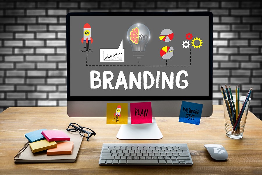
Signs Your Business Might Need a Makeover
Before diving into solutions, let’s first identify some common signs that your business might need a refresh:
- Outdated branding: If your logo, business cards, or website design look outdated, it could be time for a fresh new look.
- Inconsistent customer experience: If your print materials don’t align with your digital presence, customers might feel confused or disengaged.
- Lack of online visibility: Struggling to get noticed online or rank well in search results? You may need a digital marketing boost.
- Declining engagement: If fewer people are interacting with your business, whether on social media or in person, a new marketing strategy might help re-energise your brand.
If any of these signs sound familiar, a makeover could be exactly what your business needs.
The Power of Print: A Tangible Connection with Customers
Even in our digital age, print marketing remains a powerful tool for small businesses. Printed materials like business cards, flyers, brochures, and direct mail provide a physical connection between your brand and your customers. They can leave a lasting impression, especially when they’re well-designed and professionally produced.
Here’s how a print makeover can help your business:
- Professional designs: Well-designed print materials immediately elevate your brand, making it appear more polished and trustworthy.
- Consistency: Updating your print designs to match your digital branding creates a seamless customer experience across all touchpoints.
- Targeted marketing: Use flyers or direct mail campaigns to target specific local areas and reach potential customers who might not be online.
With fresh, cohesive print materials, your business will look modern and professional, which can inspire more trust from potential clients.
Digital Marketing: Expanding Your Reach Online
If your business isn’t taking full advantage of digital marketing, you’re missing out on a huge opportunity to reach new customers. A digital marketing makeover could include everything from a revamped website to a new social media strategy and even paid advertising campaigns.
Here’s how we can help you modernise your digital presence:
- Website redesign: Your website is your digital storefront, and it needs to reflect the quality of your services. We offer custom website designs that are user-friendly, mobile-optimised, and tailored to your brand.
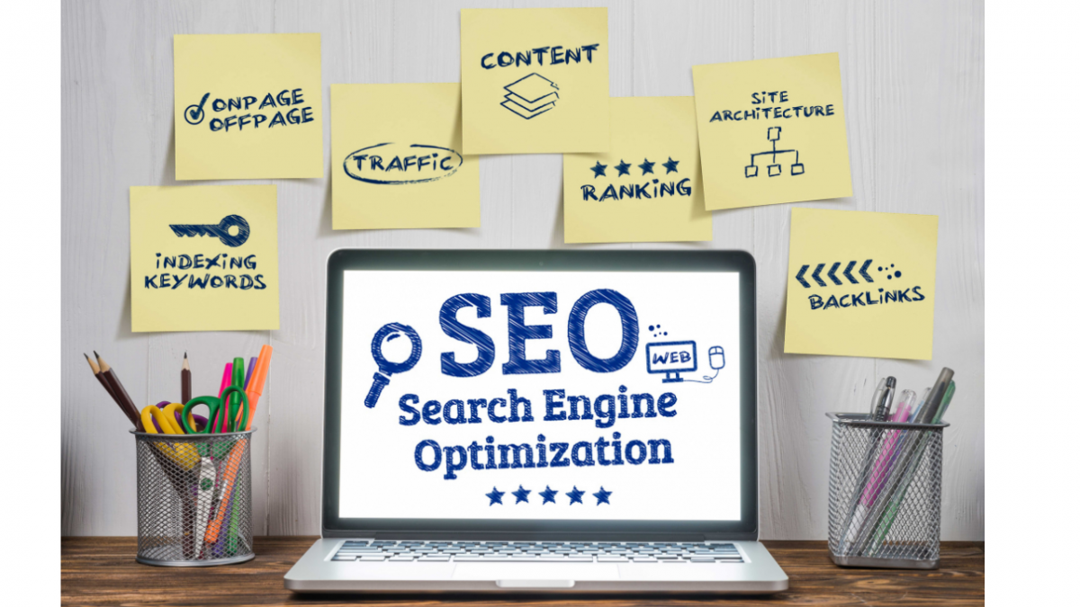
- Search engine optimization (SEO): Improving your website’s SEO will help you rank higher in search engine results, making it easier for potential customers to find you.
- Paid digital advertising: Google Ads, Facebook Ads, and other paid advertising platforms allow you to target your ideal audience with precision, driving more qualified traffic to your business.
- Social media management: A consistent, engaging social media presence is essential for connecting with today’s customers. We can help you craft posts that not only promote your services but also foster engagement with your audience.
With the right digital strategies in place, you can reach more customers, grow your brand, and increase inquiries.
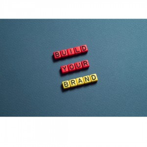
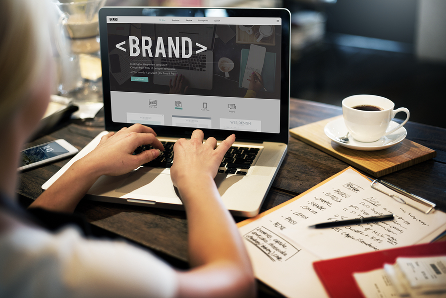
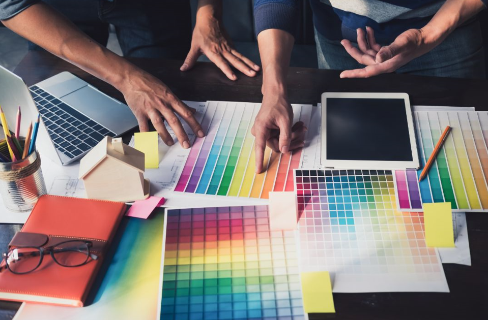
Design Services: Make a Lasting Impression
A strong brand identity starts with great design. From your logo to your website layout and marketing materials, design plays a huge role in how your business is perceived. If your brand looks inconsistent, unprofessional, or outdated, it may be time for a design refresh.
Here’s how we can help transform your brand’s design:
- Logo redesign: If your logo looks old-fashioned or doesn’t represent your business anymore, a logo redesign can breathe new life into your brand.
- Brand identity overhaul: We create cohesive branding packages, ensuring that your colors, fonts, and overall style are consistent across all platforms—online and offline.
- Website design: A visually appealing, easy-to-navigate website is essential for making a great first impression. We’ll work with you to design a site that reflects your unique business and attracts customers.
Whether it’s a fresh new logo or a complete rebrand, investing in high-quality design services can significantly improve how customers view and interact with your business.
How We Can Help You Transform Your Business
At Local Pages, we specialise in offering print, digital marketing, and design services that give your business the makeover it needs to thrive. We know that every business is unique, so we work closely with you to understand your goals and create a plan tailored specifically to your needs. Whether you’re looking for a small refresh or a complete rebrand, we’re here to help.
Ready for Your Business Makeover?
If you think it’s time to give your business a fresh new look and attract more customers, we’re here to help. With our print, digital, and design services, we’ll work with you to create a brand identity that’s modern, cohesive, and effective.
Visit The Little Blue Blog for more insights or contact us today for a free consultation at 0117 923 1122 or info@localpages.co.uk. Let’s give your business the makeover it deserves! 

 When developing or auditing your brand identity, be sure to read the