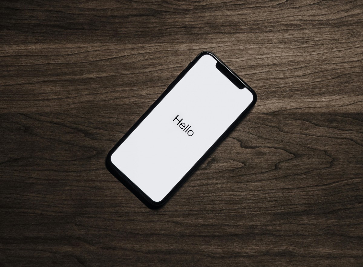
Just over 60% of users in the UK, surf the web on their mobile, not computers or laptops. So if your website doesn’t load or display very well on mobile, you can say goodbye to them becoming a paying customer!
Whether you’re looking to build a new website or simply looking to try and update an old one, here are the key things to think about when making sure your website is mobile-friendly.
Making your website mobile responsive is also going to boost your SEO! As Google and other search engines will penalise you for having a poorly optimised website.
✅ Make Sure It All Fits on One Screen
On your mobile, space is a lot less of a luxury compared to you big computer screen. If users have to swipe and scroll just to read the content, then they are just going to take their business to the next website.
Tip:
Your website should automatically resize to fit the screen — this is called a responsive design. Everything (text, images, buttons) should stack neatly and be easy to use with one hand.
🔎 Use Readable Fonts and Text Sizes
Having tiny, unreadable text is one of the most common mistakes websites fall prey to. If people have to squint or pinch the screen just to read your content, they won’t stick around.
Tip:
Use a clear and easy to read font, and make sure the size adjusts properly on smaller screens. Headings should be bold and stand out, and paragraphs should be short and well spaced.
🍔 Use a Hamburger Menu
You’ve probably seen the little three lined icon (☰) in the top corner of mobile websites, that’s a hamburger menu. It hides your navigation links in a tidy dropdown that’s easy to tap, without squishing your options into a jumbled mess!
Tip:
Instead of cramming all your links across the top, use a hamburger menu to keep things clean and simple. It helps your site look modern and keeps users focused on what matters.
🖱️ Buttons Should Be Big and Clickable
If buttons are too small or close together, they can be hard to tap on a phone, especially for the more clumsier of us!
Tip:
Make sure buttons and links are easy to tap with a thumb. Leave plenty of space between them so users don’t click the wrong one by accident.
📷 Optimise Images and Load Time
Big images look great on desktop, but they can slow down your site on mobile, especially on slower connections such as mobile data. Using smaller image formats such as SVG’s and JPG’s instead of PNG’s can help this.
Tip:
Use compressed images that still look sharp but don’t take forever to load. A faster site means a better user experience (and helps with your Google rankings too!).
💡 Prioritise the Most Important Info
Mobile users are often in a hurry. They want quick answers, not to scroll through endless content. Push the CTA’s they want, such as a “call now” or “enquire now” towards the top of the page, perhaps even put in a whatsapp link!
Tip:
Put the key stuff first: your services, contact details, opening hours, or whatever matters most. Keep it simple and make it easy to act.


 When developing or auditing your brand identity, be sure to read the