Case Study: First Year with Local Pages

Little Blue Book Directory: Customer's first year success

“Print marketing is dead…”

If you work in the print advertising industry you are likely to hear this dismissive phrase nearly every day. Whilst it is easy to see why certain businesses come to this conclusion, our recent successes and growing client base of 3,000+ suggests it is anything but!

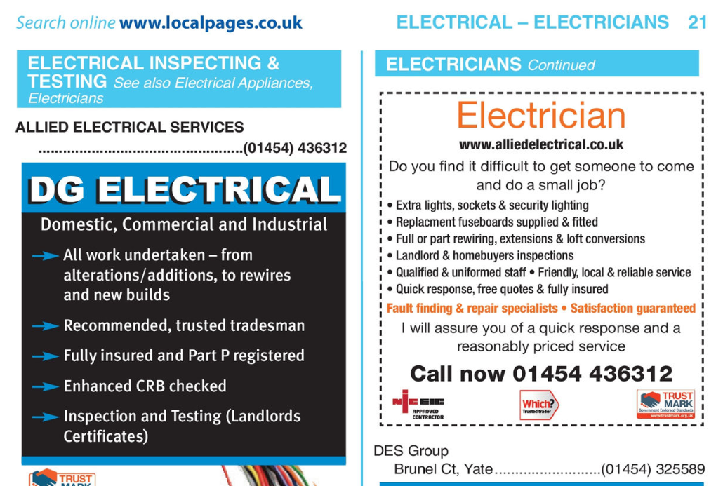
We first met Nick, who owns Allied Electrical Services Ltd, in April 2017. The meeting was regarding placing an advert in the Chipping Sodbury and Yate region with Local Pages. Whilst Nick was certainly not adverse to print advertising, there was an element of scepticism about its effectiveness in the modern market place.

Nick remembers, “I was certainly sceptical at first. Like any small business, we keep a close eye on our outgoings and marketing and were already spending a large proportion of our carefully managed budget in online advertising”.

“I was aware of the Local Pages, but as I live outside the Chipping Sodbury and Yate delivery area for the edition I was unaware of how well known the book was in the locality”.

Allied Electrical are based in Pucklechurch and provide a friendly and experienced electrical service from replacing a plug socket to a full home rewire.

Nick decided to take out a 6th of a page “Loud & Proud” advert in the Chipping Sodbury & Yate, Little Blue Book edition for 2017/18 which is delivered to approximately 18,000 address across the locality. To ensure that the advertising was worthwhile Nick placed his own trackable phone number into the advert to monitor the calls from the book and provide him with an end of year ROI.

Local Pages has produced some fantastic results for us and have renewed my advertising for a second year”.

Fast forward a year we are now compiling the new Little Blue Book for Chipping Sodbury and Yate 2018/19. Speaking to Nick upon the renewal of his advert, he provided us with this fantastic feedback.

“It was my first year with Local Pages and as a business owner who tracks carefully where our enquiries come from, I was sceptical on whether I would receive a response from print advertising. In fact, Local Pages has produced some fantastic results for us and have renewed my advertising for a second year”.


If you are a business owner it is easy to get sucked into thinking that all of your advertising spend should be allocated towards digital mediums. We certainly champion digital marketing and have a team that provides great value, local, digital marketing solutions. However, print advertising is still a valuable tool (especially to the trades) and finding an advertising vehicle that works is essential to this.

Local Pages’ Little Blue Books have been in production for nearly 40 years. We are trusted and well known in the regions we cover. We work closely with our clients and utilise trackable phone numbers and online statistics to ensure that your advert is providing you with a positive ROI.

You can view more about the ROI we have provided for different industries, the demographics of our users and find out more about Local Pages by viewing our media pack.

Interested in placing an advert? Contact us now to discuss an advert placement.

Share Button
Leave a comment on Case Study: First Year with Local PagesCategories Advertising, Blog, Marketing, Print

How To Be Creative: A Designer’s Guide

Local Pages` creative designer explores the issue

Are we born with a creative mind, as opposed to a mathematical mind? Some say we are, and that we can’t be both. We are either governed by the right side (the creative side), or left side (the logical side). This is only a theory – that our characteristics come through according to which side is more dominant. But new research says otherwise.

Creativity can be nurtured in someone who perhaps thinks they are not creative. We all have to be creative to solve problems in life in one way or another. Obviously creativity is very subjective. If you asked 10 different people for feedback on your creative ideas, you’d get 10 different answers! Do not let criticism strangle your creative process. It’s good to listen to others and their constructive criticism, and by taking the positive out of this, you can use some of what they say to play around with other ideas.

Nothing is perfect, so don’t feel you have to come up with the perfect solution. Don’t rule out working on ideas that perhaps you are not so keen on because following these paths may make you come up with another solution that fits. Of course someone who is trained in creativeness will be able to initiate ideas quicker than someone with no experience.

Some creative designers prefer to work on their own but for ideas to flow, it’s always good to share. This is called “brainstorming”, where a few creative minds get together and thrash out an idea or concept by drawing on bits of paper with doodles or writing them down or sharing them verbally. People can bounce ideas off of each other then and perhaps take their ideas one step further in a way they hadn’t thought of. The initial brief needs to be clear and concise though. You cannot say everything in one design, so good communication is the key.

Inspiration is always a good starting point. Collect pictures, patterns or colours that you like in the form of magazine articles, photos or illustrations and make a book of them. Anything that catches your eye. Some small thing, like a colour, may spark off a flurry of creativeness and lead you in all sorts of directions. The internet is obviously a good place to explore for ideas too. Save the pages and images you like into a file on your Mac or PC and use them to get the creative juices flowing.

Think of children and how unselfconcious they generally are. Try and think like a child and your imagination may take you on a very creative journey. Try not to be too analytical. Perhaps use  a list of single words to describe the possible answers to your brief. Each word may spark an idea which may encapsulate the personality or essence of the message you want to put across. Look up key words in a thesaurus or dictionary, which in turn may spark a visual metaphor.

Let’s make up an example: Let’s say we need to design a poster for a dog’s home – they want something positive to advertise what they do. Write down key words when you think of dogs or animal sanctuaries. My thoughts are: unconditional / beautiful / refuge / safety / cuddles / fur  – the list could go on and on. Look up some of these words in a dictionary or thesaurus. I looked up “refuge”. The dictionary says “a place or situation providing safety or shelter”. Or “safety” – “the condition of being protected from or unlikely to cause danger, risk, or injury”.

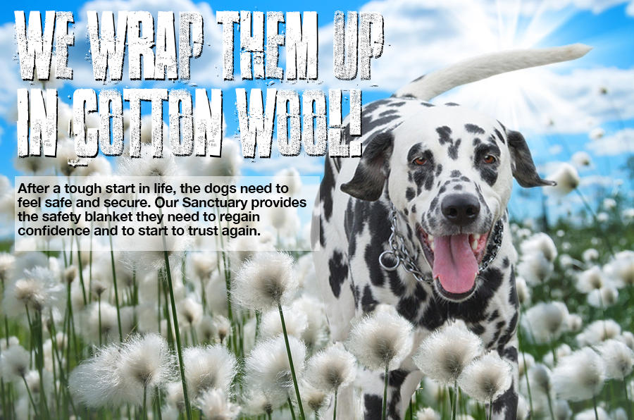
Working on the word “safety”, I came up with an idea. “Safety” sparked a visual of cotton wool – you probably know the phrase – “wrap someone up in cotton wool” which suggests keeping that person safe from harm as cotton wool is so soft and inviting. This was my very first thought (write down all thoughts) and it came to me in a matter of seconds: So how about a picture of a dog surrounded by cotton wool or bouncing around a field of cotton wool?! So in a few minutes I already have one positive idea. I have roughly illustrated my idea it below.


Creative

So, now you have seen a brief outline of the creative process, go and play away! Do you have any tips of how to be creative? We’d love it if you share your own creative process below.

Share Button
Leave a comment on How To Be Creative: A Designer’s GuideCategories Blog, Branding, Design, PrintTags , , ,

How To Make Your Business Cards Stand Out

A Guide From Graphic Designer Tania Taber

Business cards are a great marketing opportunity. If you haven’t got one to give out to prospective clients, you will be missing out on potential business.

To save money, a lot of companies go to one of those online print companies and get a card churned out – you know the sort of thing – perhaps a bit of that infamous typeface “comic sans” and a cheeky cartoon or a bland clip art image – these are usually a disappointment in terms of the look and feel of the card and the general design, creating a not-so-professional image. And of course, others may use the same image as is on your card so it’s not unique to you. There are several business cards I have come across supplied by an online printers using the very same stylised illustration of animals for their business – one was for an animal acupuncturist and the other for a dog walking business. This is very confusing!

So, it’s important to get it right. It needs to stand out against the many competitors in your marketplace. You will be handing these cards out to people you meet and they will take a very quick look and then put it in their purse or wallet. So you have to grab their attention in a few seconds and this will ensure they remember you and your business.

The first thing worth mentioning is to make sure everything is spelt correctly and the information is spot-on. It may seem silly to mention this, but you’d be surprised what gets through. If there are any spelling errors, it will give the impression that your business is unprofessional and not up to the job.

You need to make sure that nothing wanders off the edge of the card so make sure you keep all written information 5mm from the edge. Any images used need to be of high quality – the higher the resolution, the better. Typography also needs to be legible – 7.5pt is the minimum size – but not too big though, as there is limited space on the card.

Be careful not to overcrowd it with information too. A typical business card size is: 85mm x 55mm. Even though the space is limited, you can still get creative! The only things that need to be on the card are: Name, job title, address, telephone numbers, email address and website, and of course THE LOGO! There is no need for company registration numbers. There might be some room for a strap line though (think “Every Little Helps” by Tesco or “I’m lovin’ it” by McDonald’s). A strap line should be as succinct as possible, five words or less if possible, and should convey the essence of your brand.


business cards


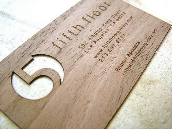
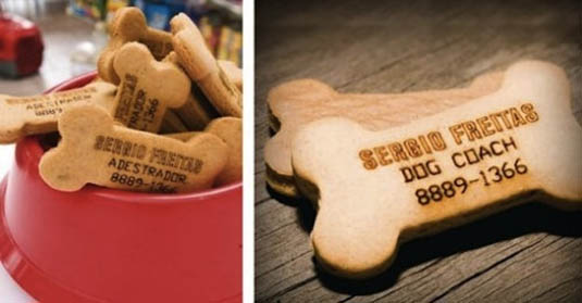
To really make the business cards stand out you can use special finishes on it to make it more tactile and memorable. Things like a spot UV (a shiny bit!) or a metallic ink or perhaps a die-cut (a funny shape cut out of the card). Of course, this makes the printing more expensive but can more than make up for that by reaping the rewards in terms of new business afterwards. Or sometimes companies go one step further and have their cards made out of materials other than card. Be as creative as your imagination or your designer’s flair allows!


business cards


Choose fonts to match your logo – either a sans serif (like Helvetica) or a serif face (like Times Roman which have flourishes at the end of the strokes). Colours must also reflect your logo with black as a good colour choice for the type information so it’s as readable as possible.


business cards


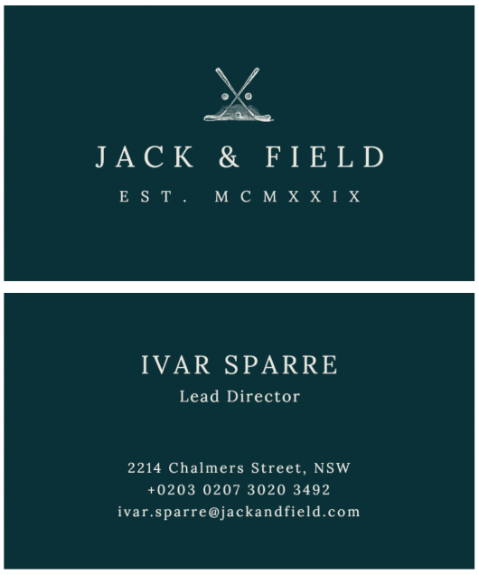
So in summary, the business cards must reflect your business and what you are trying to convey – perhaps your business was established by a family member in centuries past – you may wish to convey this with a classic design indicating a company that can be relied on, that’s classic, that is traditional, that has stood the test of time, or a new company wanting to convey structure, modernity, simplicity or freshness. Let your imagination take you to the recesses of your mind and go create!

Share Button
Leave a comment on How To Make Your Business Cards Stand OutCategories Branding, Business Tips, Design, Print, Small businessesTags , , , ,

Welcome to The Little Blue Blog!

Hello and welcome to the Little Blue Blog! We’re so happy you found our little corner of the Internet. Here we hope to provide both practical and informative weekly content on how to effectively market and grow your small business; alongside some interviews with local businesses and snapshots from the areas where our Little Blue Books are distributed. 

Local Pages was founded in 1979 by Boris Bernard. It remains a family company to this day with his two sons, Dan and Ollie at the helm supported by their amazing team. The world has changed a lot since the 70’s. Promoting and marketing your business has never been easier, yet at the same time, it’s more complex than ever with the overwhelming amount of platforms and ways to do this.

We’re passionate about small businesses and our goal is to become a one-stop-shop for all marketing strategy. From advertising in our heritage Little Blue Books to social media and website design & hosting, we’re here to provide solutions. Connecting local people with local businesses is at the core of Local Pages.

Thanks for stopping by! We’re a friendly bunch, so please feel free to comment on or share our posts – we’d love hearing from you. Don’t forget to like us on Facebook and follow us on Twitter and LinkedIn and please subscribe to The Little Blue Blog.

Share Button
Leave a comment on Welcome to The Little Blue Blog!Categories Advertising, Design, Marketing, Print, Small businesses, Social media, WebsitesTags , , ,