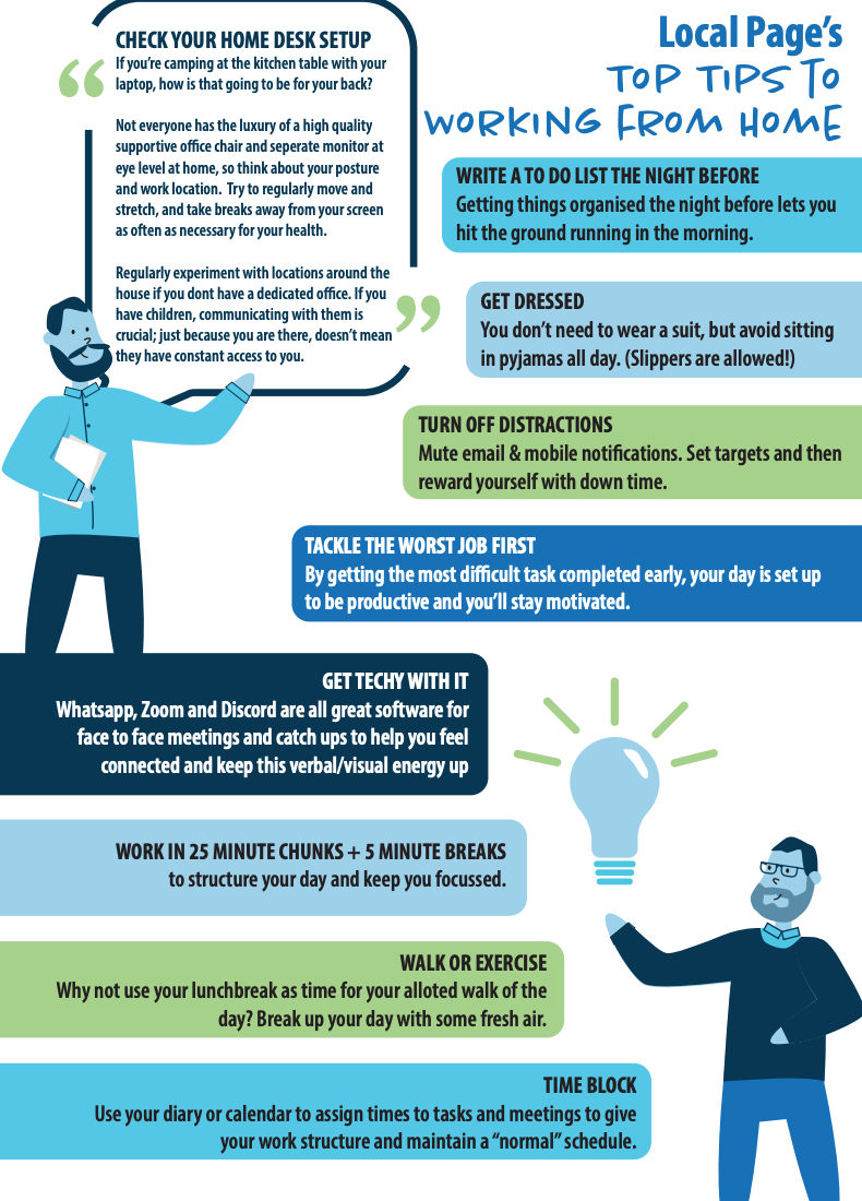
Working from home is not as easy as it seems. Not only are there a host of distractions, but there is your mental and physical health to consider. By not travelling to work every day, it is easy to overlook the physical benefits of getting to there and the social benefits of interacting with colleagues.
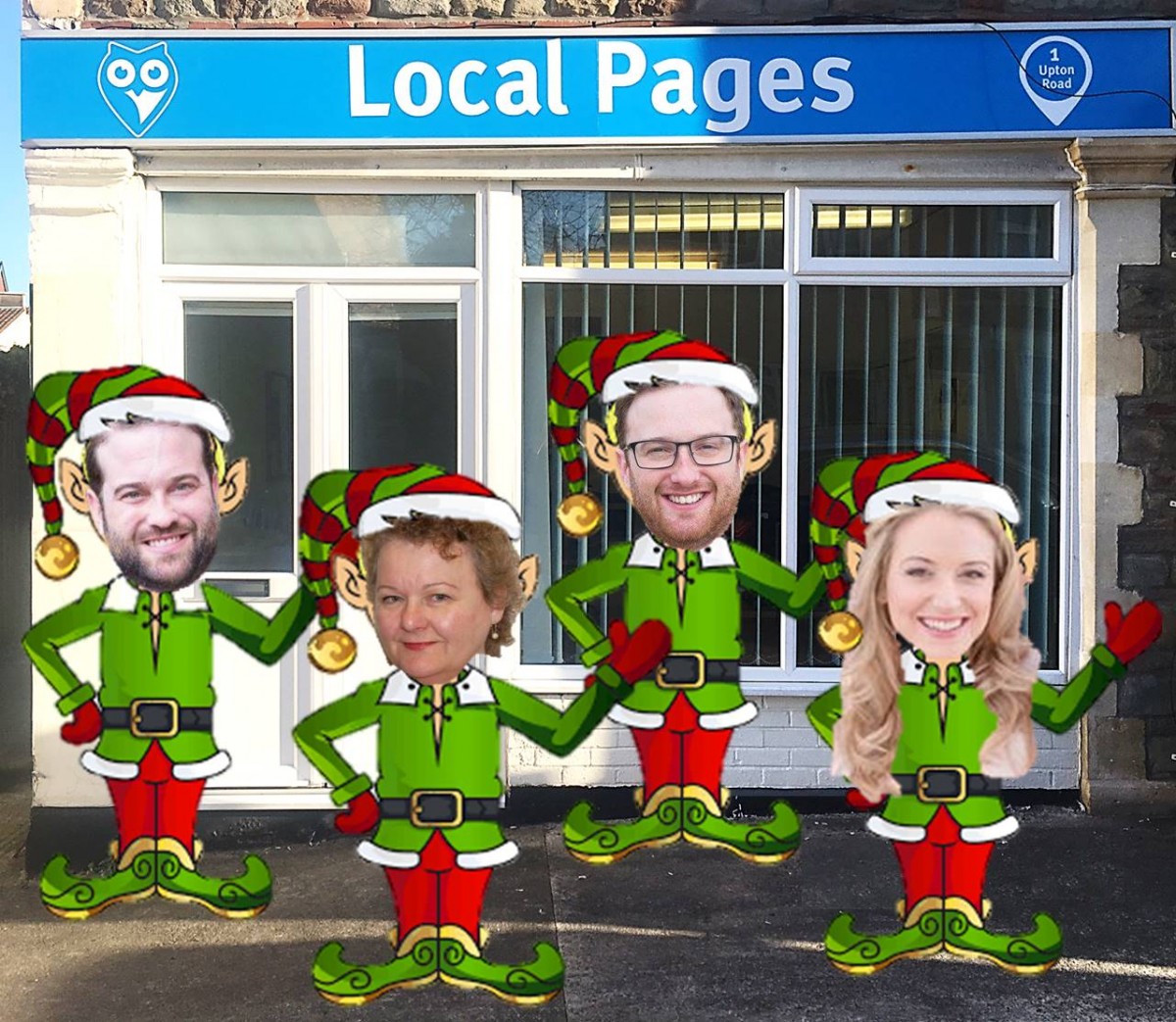
So to help you keep productive and sane, here are the Local Pages’ tips for successfully working from home.